Your Cart is Empty
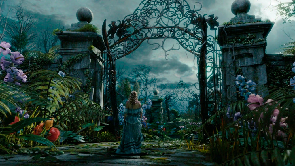
Moody Maximalism is a combination of 2 styles - Moody aesthetic, which features dark colors, dim lighting, and dreary muted colors, and Maximalism, which is the antithesis of minimalism and centered around the idea that “more is more.” Their fusion yields a surprisingly cohesive and refreshing style. Maximalism lends the moody aesthetic the vibrancy and flair it needs to turn it from dreary to dreamy but often edges towards nightmarish. Moody Maximalism falls somewhere in between Dark Academia and a fever dream from Alice in Wonderland.

This bold design trend has taken the internet and world by a chokehold, and you have likely seen it before browsing through Pinterest, Instagram, or TikTok. We definitely have. Moody Maximalism creates completely captivating spaces with endless texture, saturated colors, high contrast, and layering -- a balance of vibrancy and darkness. There are other similar internet-fueled spooky interior design trends, such as addamscore, halloweencore, witchcore, whimsigoth aesthetic, and horror aesthetic. Most of them look like someone took their Halloween decorations VERY seriously.
Moody Maximalism is founded on the premise of being in a dark space and filling that void with an abundance of exciting and stimulating things to liven it up and create contrast. That probably has a deeper societal meaning, but it is best not to go down that rabbit hole.

Maximalism originated in the Victorian Era of the 1800s, and it’s imagined that the infusion of darkness into the trend took place sometime around then, too. Modern-day Moody Maximalism is largely inspired by Harry Potter’s Hogwarts, the Addams Family (and recent spinoff Wednesday), Alice in Wonderland, and Dark Academia design (which originated on Tumblr in the mid-2010’s).

Although these design aesthetics are similar, they do have some key differences. Dark Academia tends to be less colorful than Moody Maximalism and doesn’t always feature maximalist decor. Dark Academia frequently features stone & antique style wood fixtures and walls, antique academic/university decor, and leans closer to Gothic era design. Moody Maximalism is much closer to Victorian-era design but is essentially a blend of Gothic and Victorian-era design mixed with some new-age retro and maximalist layering. It’s also rare to find a Moody Maximalist space that doesn’t have live plants, floral patterns, or plant decor, while in Dark Academia, most botanicals will be dried flowers, dead roses, and viney house plants.
| Moody Maximalism | Dark Academia |
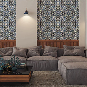
Glad you asked. Tile is as versatile as paint or wallpaper, coming in an endless amount of designs, colors, patterns, and textures - the options are limitless. Not to mention, tile can add reflective elements such as glossiness and 3D texture that other surfaces can’t provide to the same degree. Checkerboard patterns are also common in Moody Maximalism, and there is no better way to add that pattern to a room than with tile. See our checkerboard tile collections to explore some of these combinations.
Featured Tile: NERO MARQUINA marble
Absolutely, which is why we have invited Kristan Jadwick from ERIC COLBERT & ASSOCIATES here to answer some questions for us and provide her insight on the trend. Kristan is a commercial designer who has been involved in the city’s vibrant multifamily design community in the Washington D.C. metropolitan region for over 19 years.
Does it exist commercially & where/how is it utilized?
For multifamily, the layering that typically is associated with Maximalism is reserved for where there is a more intimate space. So, a lobby where space is a premium (due to ground-level retail commanding more square footage), most owners want to create a more expansive experience for residents. But amenity areas like libraries, lounges, restrooms, mailrooms, etc, where the scale of the space is reduced, or residents are more likely to spend time, are great opportunities. The ‘curiosity shop’ doesn’t feature as prominently as layered materials, where texture and pattern can be used to encourage a resident or visitor to explore and experience a space more slowly. Moody Maximalism can bring the pace of that exploration down so that a resident doesn’t experience the sensory overload of commercial space featuring maximalist design. All styles tend to be lightly accessorized rather than fixed and easily maintained materiality.
Is it a hard design trend to sell clients on commercially?
Yes and no. Multifamily takes a more hybrid approach, where a project strives for identity to distinguish itself from other similar experiences but still needs to appeal to enough of the targeted rental/condo demographic to maximize its occupancy. More complex layering, transitions, and scale can create a sense of coziness and comfort that encourages residents to linger and look around rather than move quickly through to personal zones.
Do you have trouble finding products that fit the aesthetic?
I’m seeing more products every day!
Do commercial trends start 2 years before residential? Is this the same for all trends?
Multifamily trends may be slightly behind both commercial and single-family residential due to its need for longevity/mass appeal.
How long do trends like this typically last commercially & what does that translate to?
“Trendy” doesn’t generally work for multifamily design; in fact, finish palettes are often updated if initial selections are made more than two years before the project moves forward. Often, a developer’s signature style as a brand is present, or the project creates an identity at a fixed point in time. Moody Maximalism offers a way to bring in more traditional elements like jewel tones, darker warm woods, damasks, botanicals, etc., but recombine them in a way that feels new and exciting so it can have broader appeal.
Where is best to go for commercial inspiration in Moody Maximalism?
Tile and wallcovering manufacturers are my favorite resources.
Do you have any favorite tiles or products that fit the aesthetic?
Wallcoverings - Astek and Milton&King (especially Strawberries&Figs!) for murals and toiles in dramatic colorways.
Tile – Architessa “Flora,” “Botanicals,” and “Directions” offer deep jewel tones, texture, and mural motifs at various scales that are fun to combine.
 |
||
| Flora | Botanicals | Directions |
Now that you know what Moody Maximalism is, it’s time to get inspired. Check out our Pinterest board below to see more.
----------------------------------------------

Austin Meyer brings a background in professional real-estate photography, graphic design, and copywriting to the table.
As marketing specialist, he manages blogs, email marketing, photography, video editing. copywriting, SEO, and website design, amongst other things. Austin has both an eye for the big picture and little details, and wields creativity and positivity in everything he does.

Kristan Jadwick joined Eric Colbert & Associates in 2016. She has been involved in the city’s vibrant multifamily design community in the Washington D.C. metropolitan region for over 19 years. Prior to joining ECA, Kristan managed several affordable housing and market-rate projects from conception through construction, including furniture, fixture and art installations. Kristan received a Bachelor of Science in Architecture from Clemson University. Kristan is current finishing a 139-unit high-rise for formerly homeless clients in DC that combines elements of trauma informed and biophilic design.
